Vistra Framing & Gallery, Eugene, OR
There was enough interest in looking at different lettering/font forms, that we set aside a whole meeting to explore.
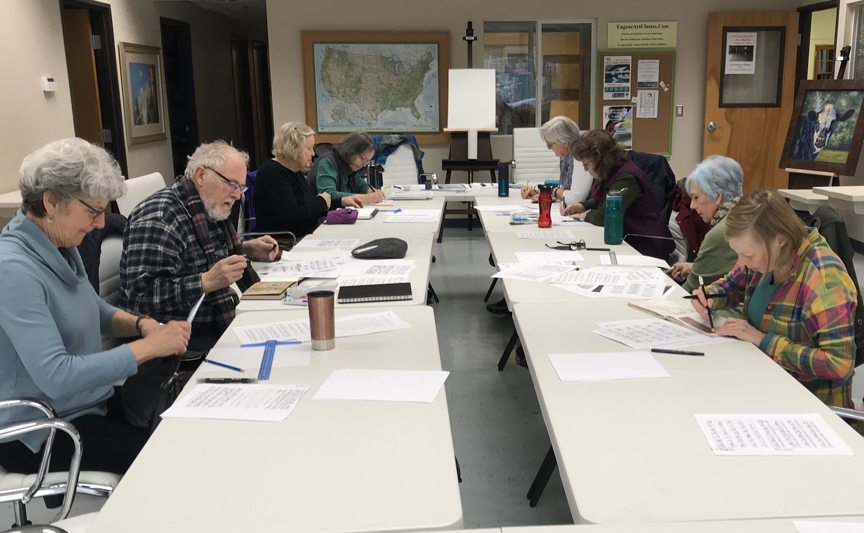 Penny, Ken, Lona, Marsha, Katie, Bev, Marnie, & Barb Sh. Jane was behind the camera, Erik had to leave early, & Lealan came late.
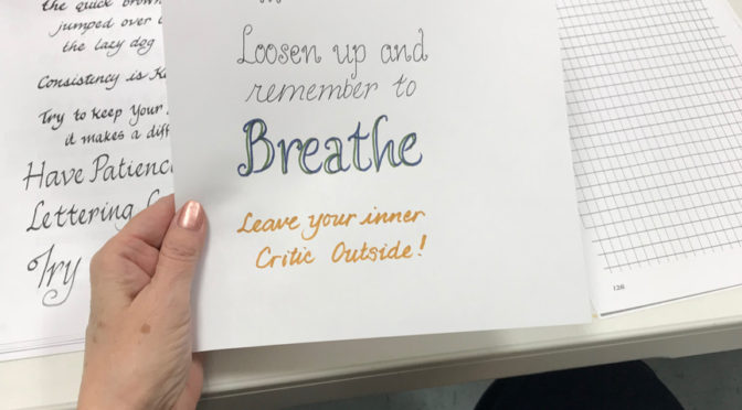
 Jane and Katie brought handouts of lettering styles, and Jane had a bunch of felt-tip calligraphy pens people were eager to try.
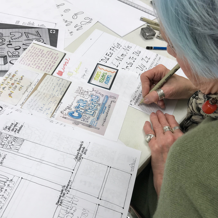
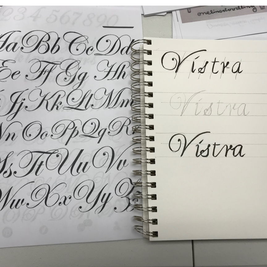
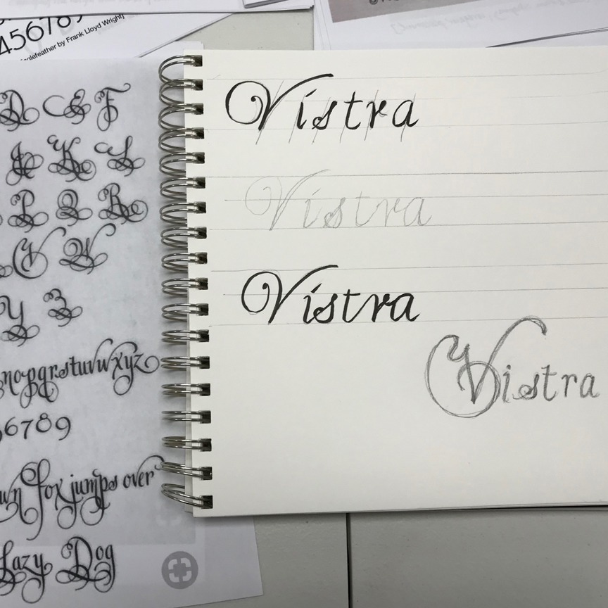
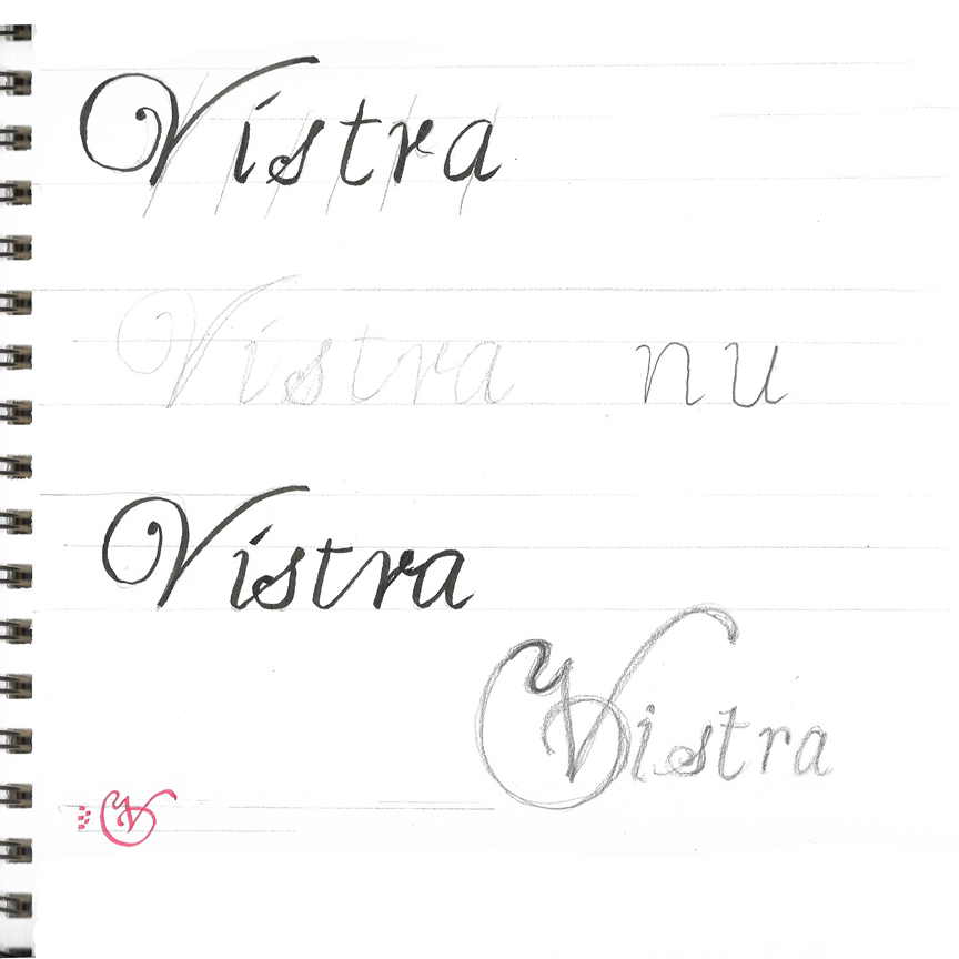
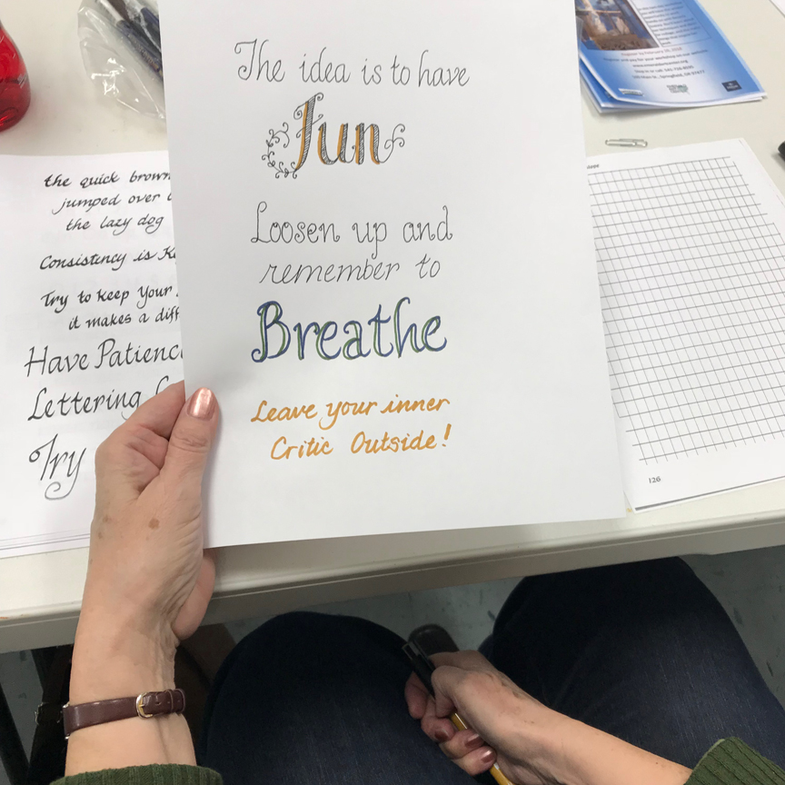
 Barb Sh started out exploring Italic Cursive, then tried different embellishments, too. She’s going to have a lot of fun with this.
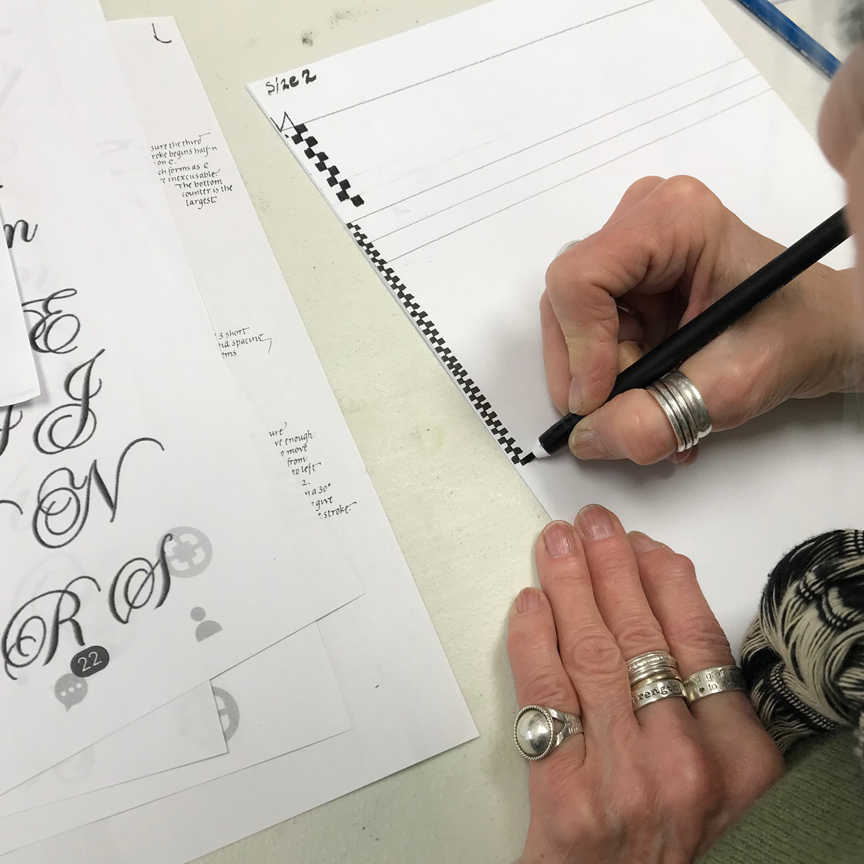
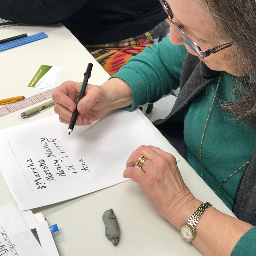
 Marnie marks off pen widths for making guidelines (5 pen widths for italic). She was a great example of how people got into the task!
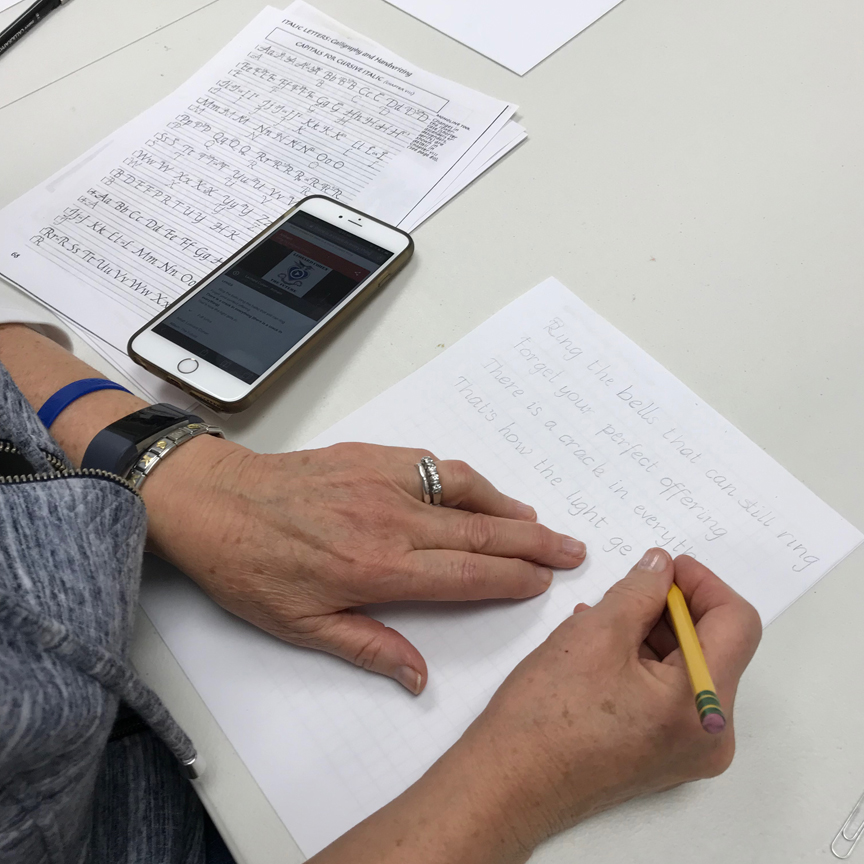
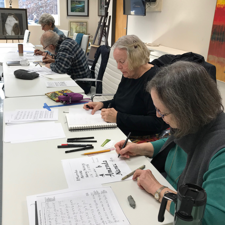
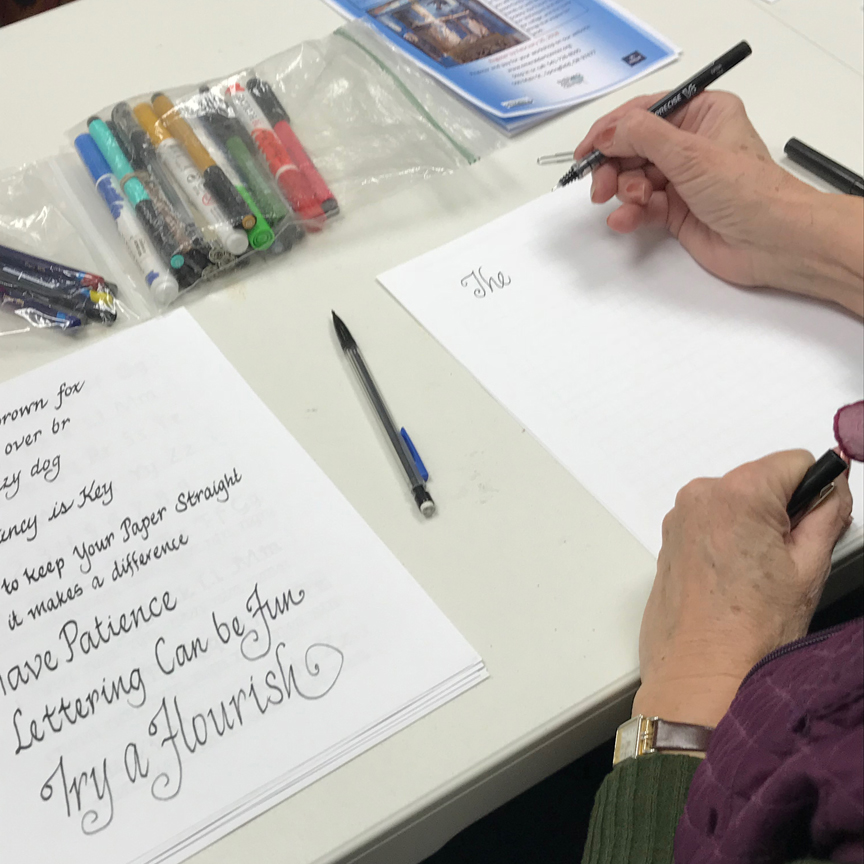
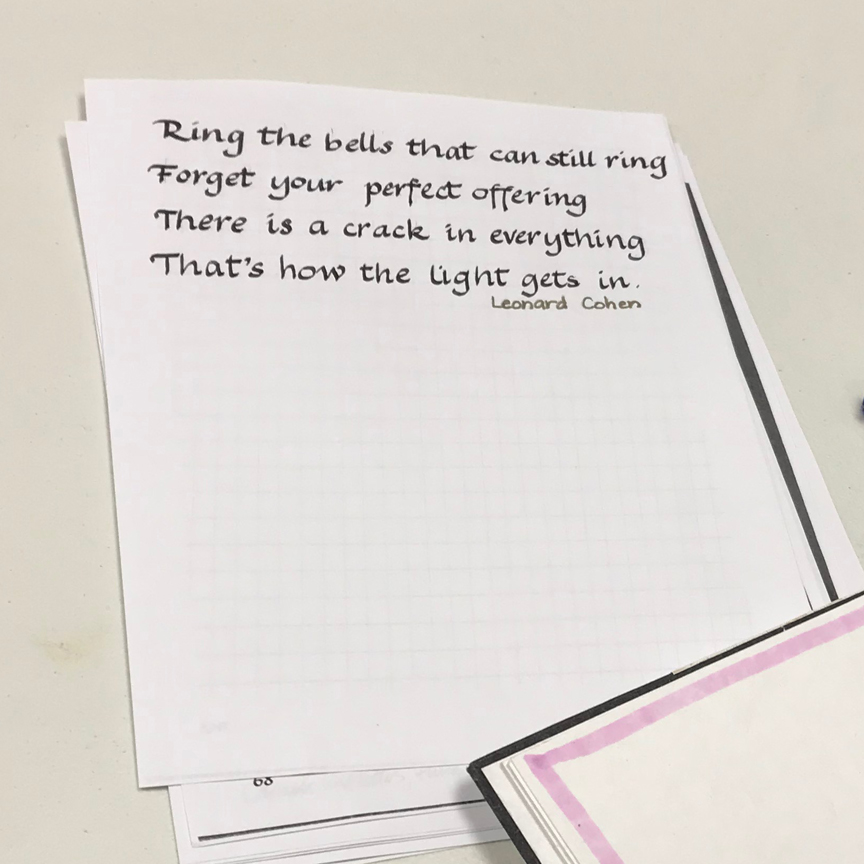 Katie demonstrated good lettering style – paper straight in from of her, model sheet to refer to, light lettering in pencil, then ink.
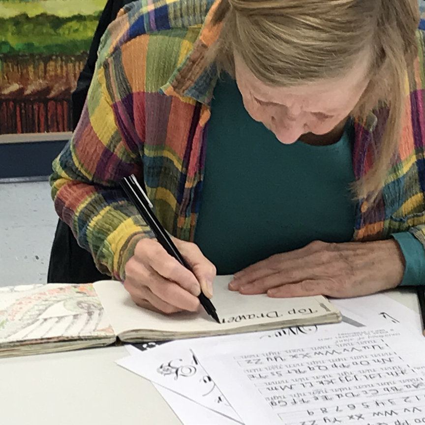
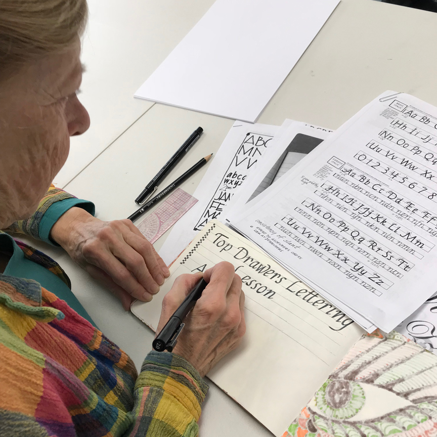
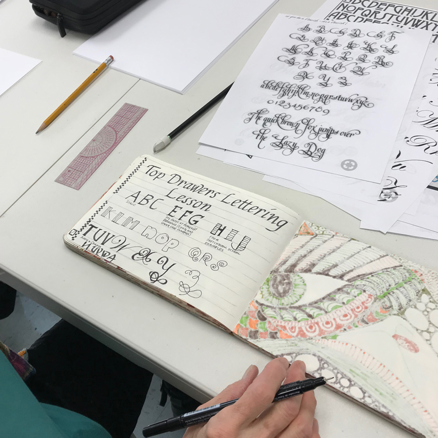
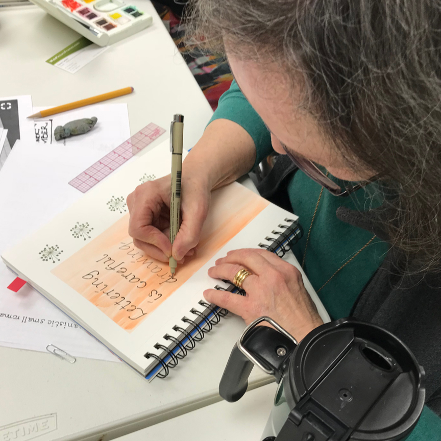 Marsha immediately applied the lesson to her sketchbook.
 Ken took a tip from the have fun idea of adding embellishments.
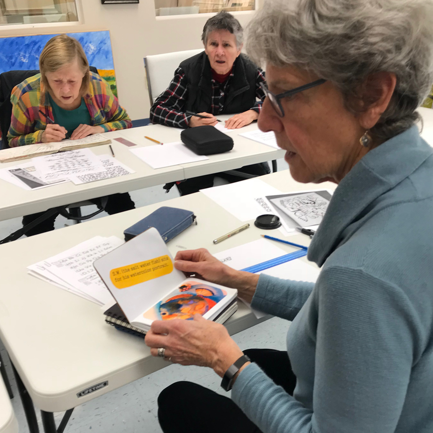
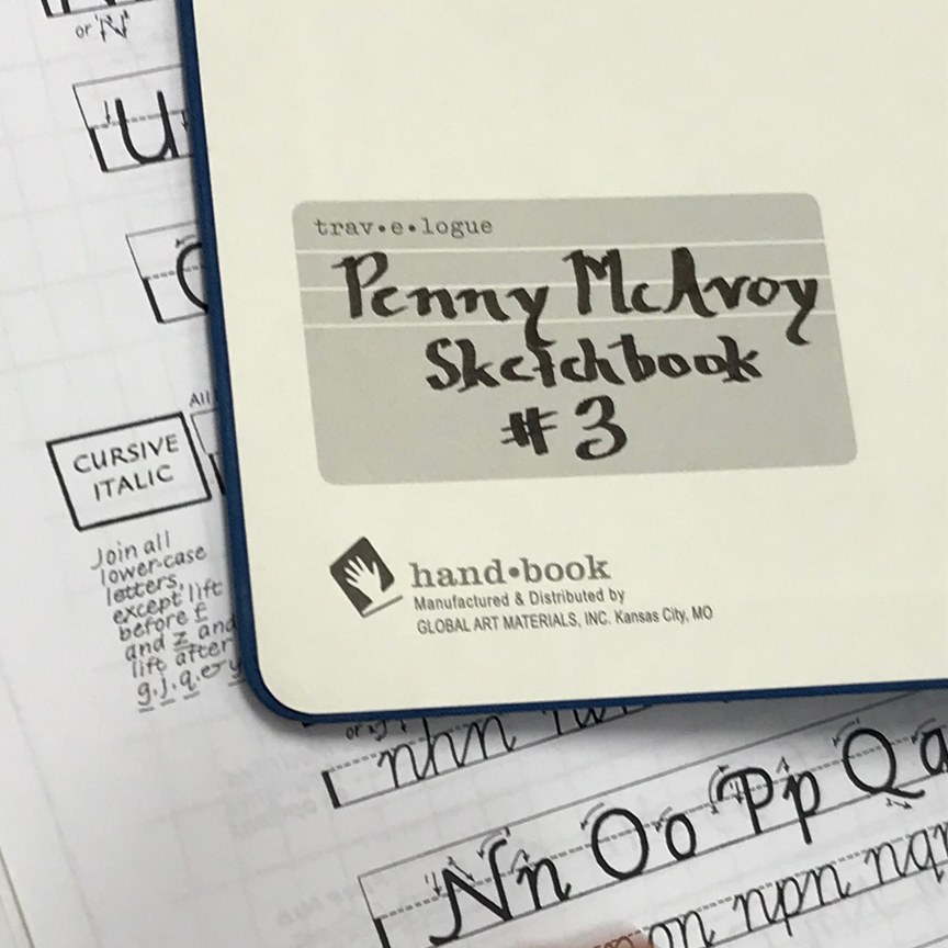 Lona put in her typical vivid background, & shared her sketchbook she’s sending to the sketchbook library (wow!) with Penny.
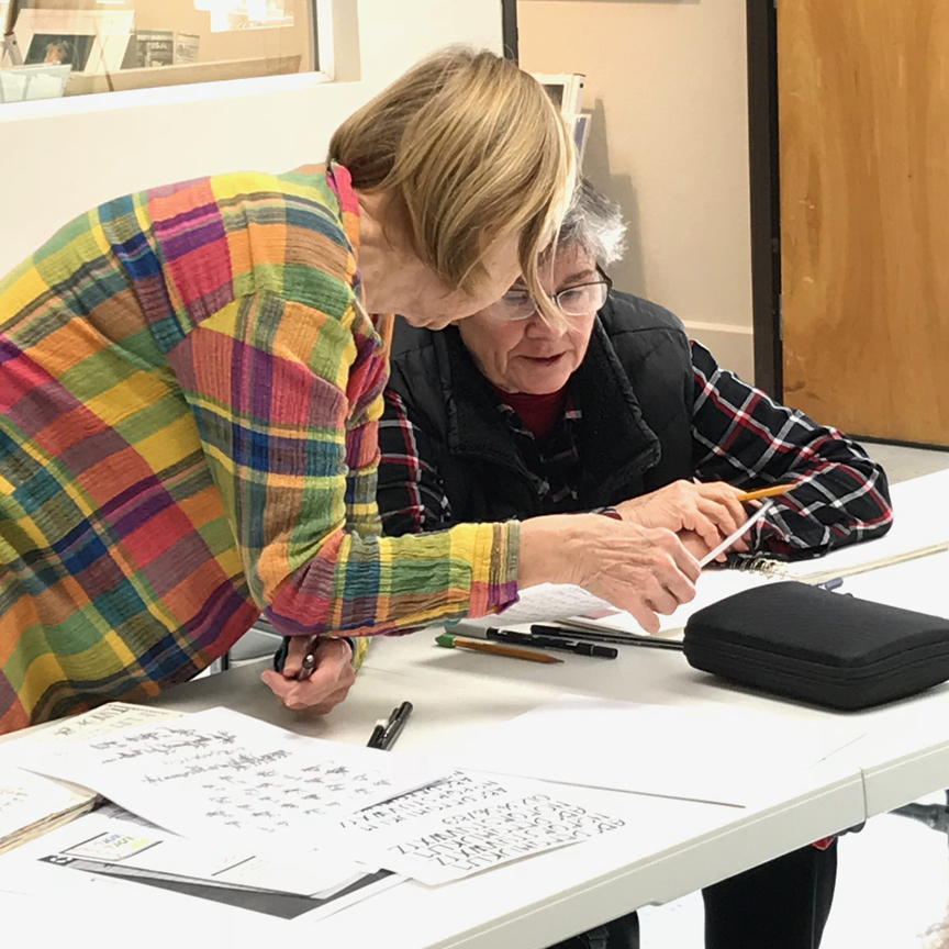
 Barb Sh catches Lealan up on the lettering process – a great friend.
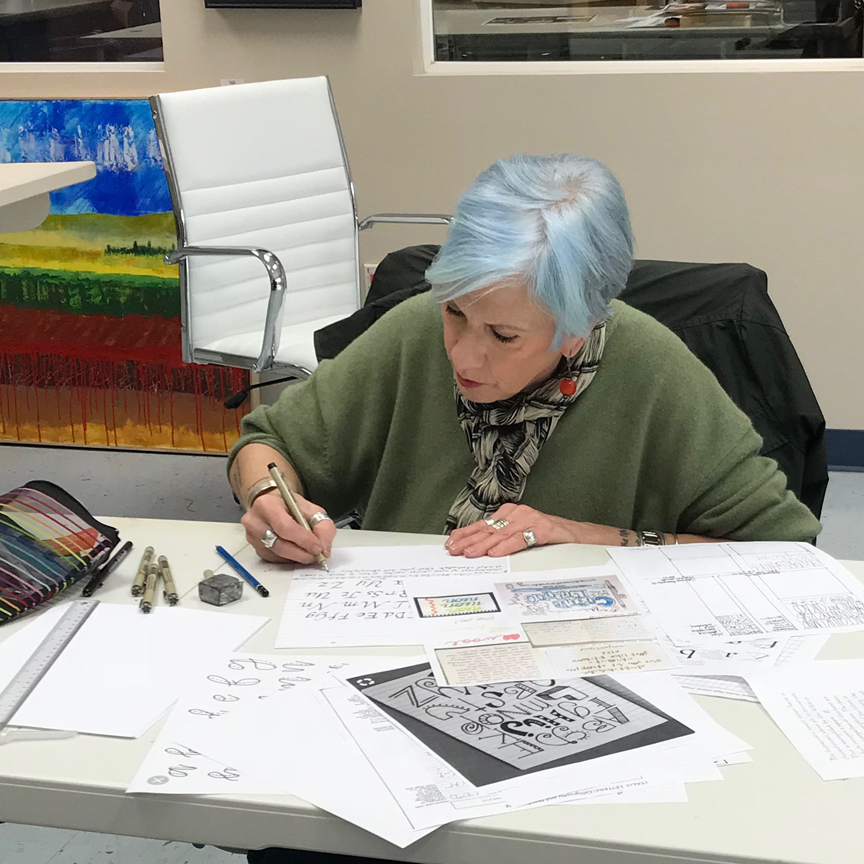
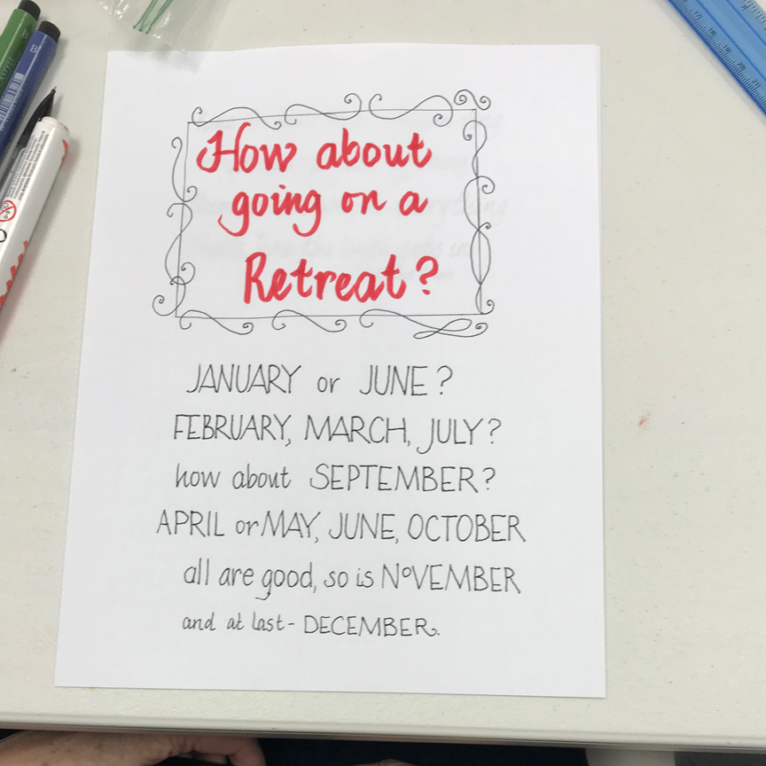
 Jane had taken calligraphy classes before, so she tried doing a new script, first with brush pen (oops, the slant was SO inconsistent!), then pencil, and finally with a small calligraphy pen with red ink.
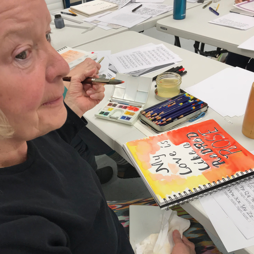
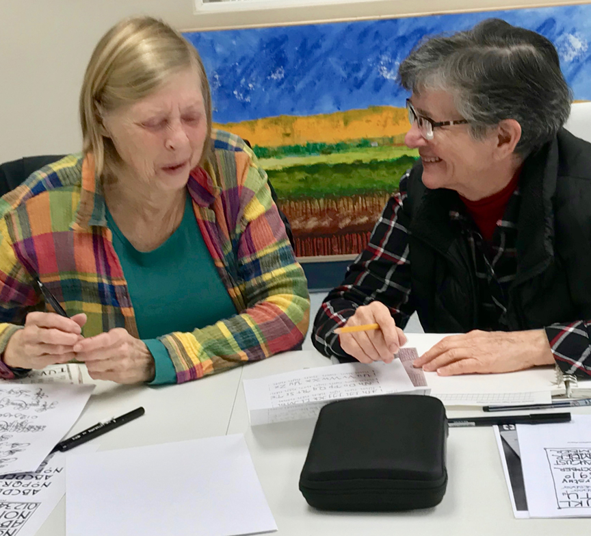
 It was easy to see that Bev has had prior training and lots of practice, because look at how she applied all the options in her lettering!