Theo’s Coffee House/Whirled Pies, Eugene, OR
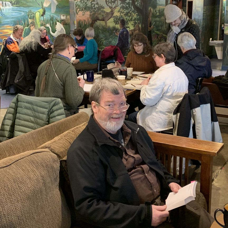
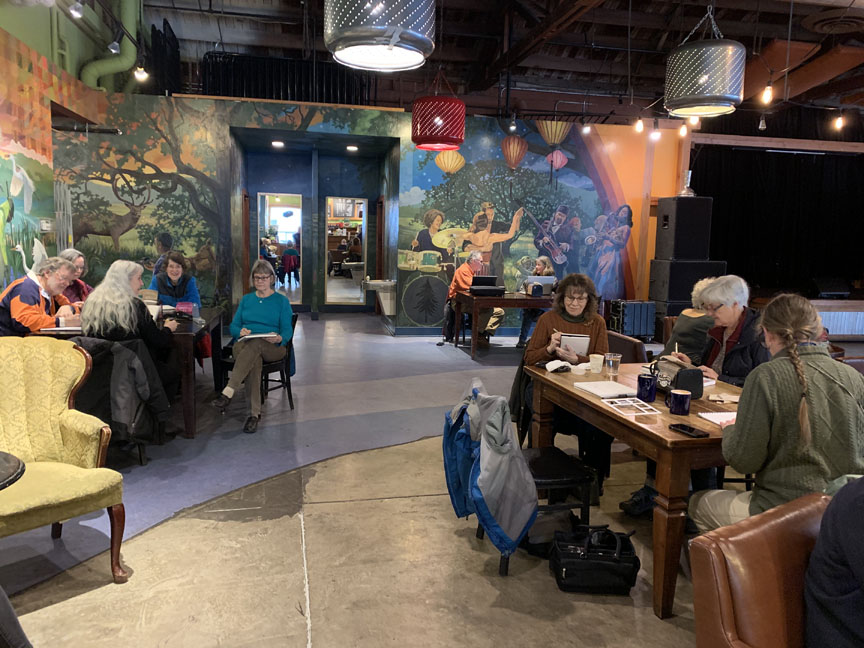 Danita’s Michael has a good book, while we find things to sketch. Jim H., Danita, Bitty, Marsha, Peggy, Katie, Bev, Daisy, Sandy, Katie.
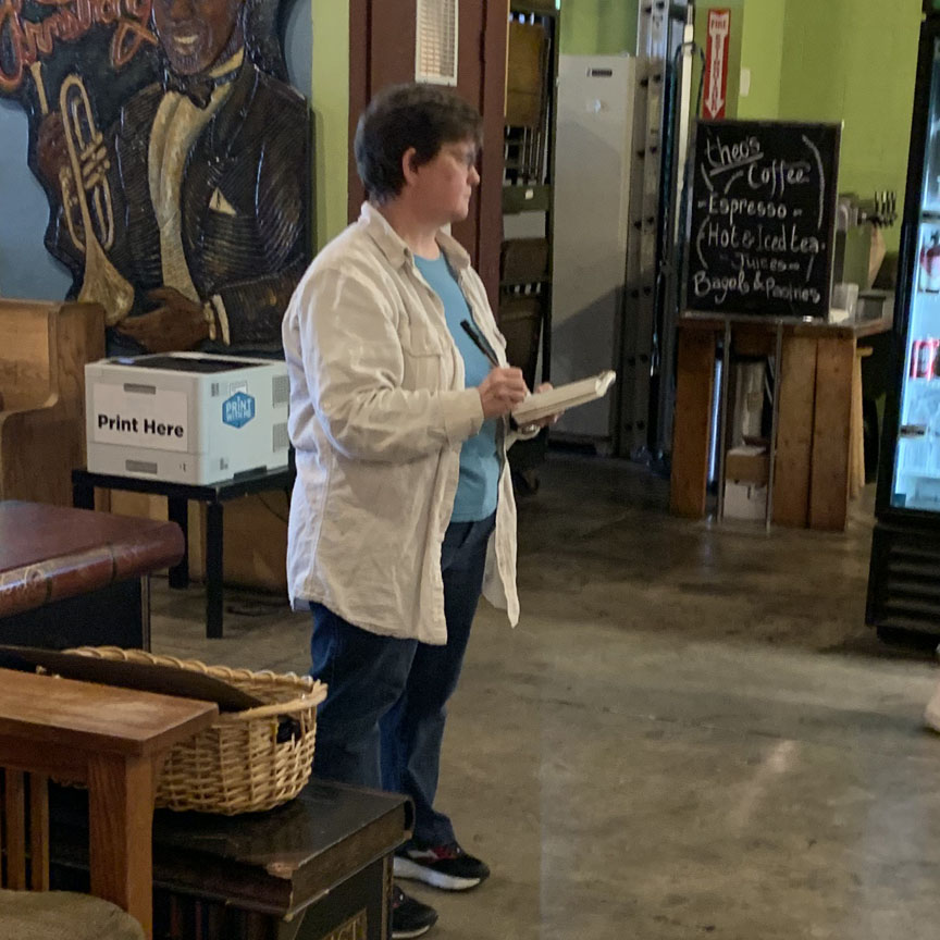
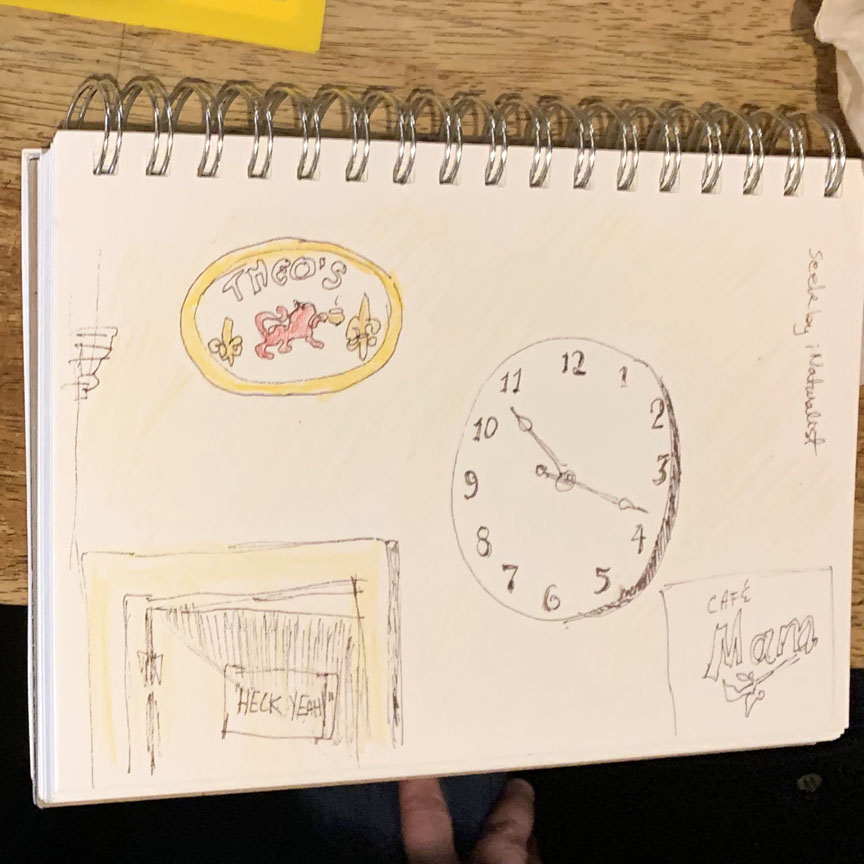
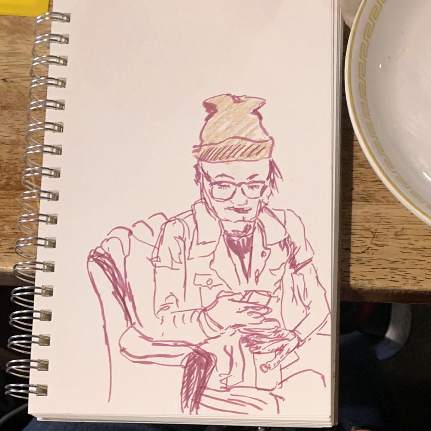 Daisy got right after it – first the artifacts on the wall, then a great portrait subject totally motionless on her cell phone. Great!
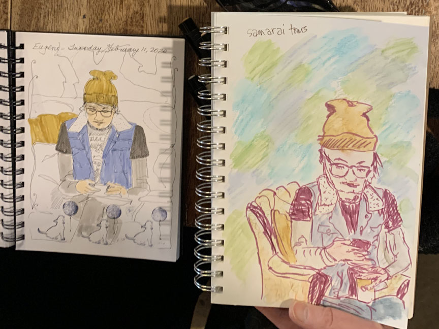 It turned out that Bev & Daisy chose the same subject, but different styles & tools – Bev: Pitt pens; Daisy: Copic marker, colored pencils.
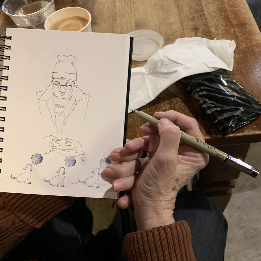
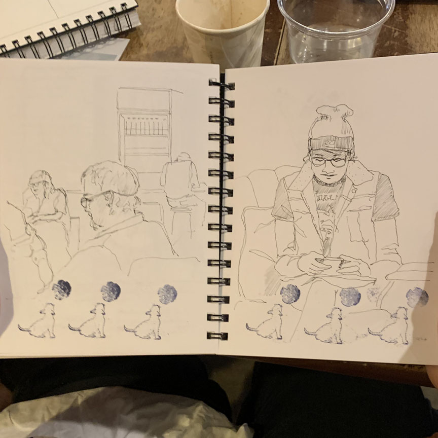
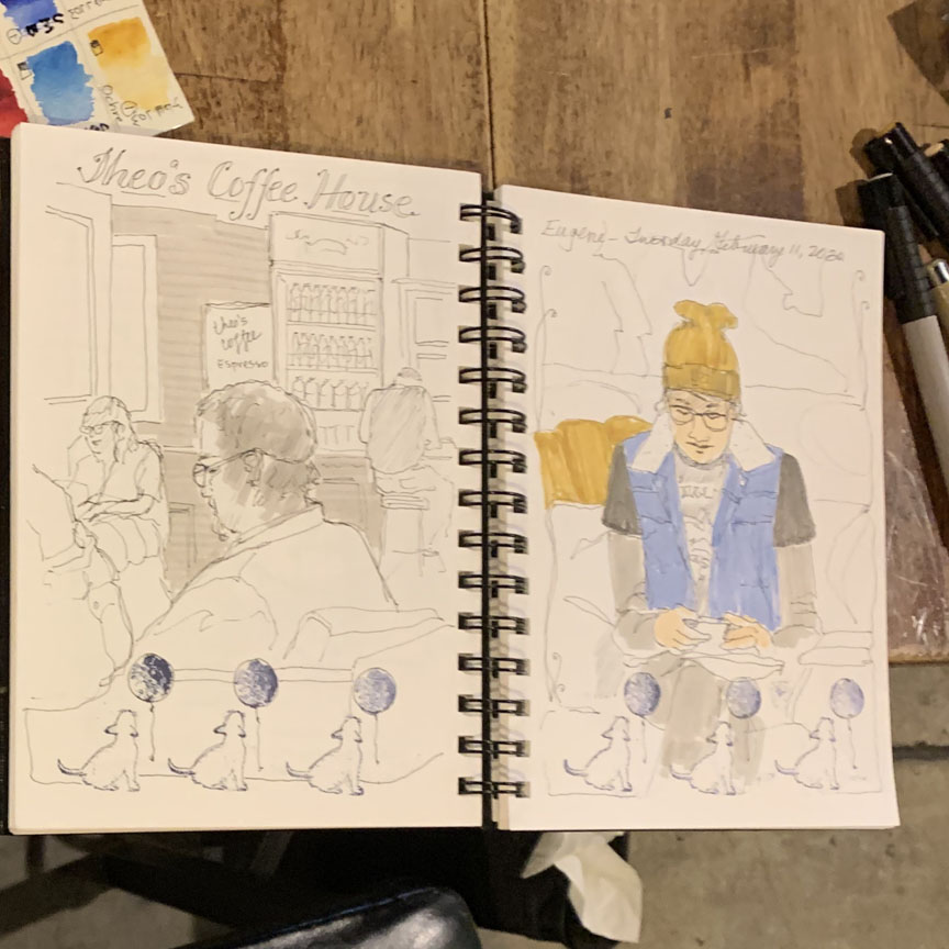 Here’s how Bev’s sketch developed. The grey value markers are great fun to use, too – note her sketch on the left side of the book.
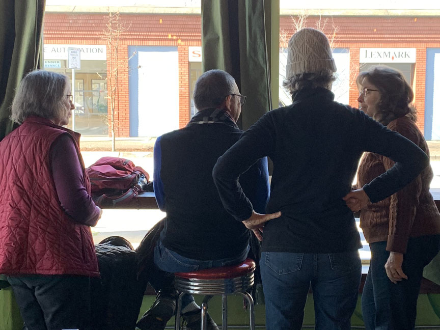 Marsha & Bev had to come see what Hugh & Sandy were doing at the counter looking outside – nice light here!
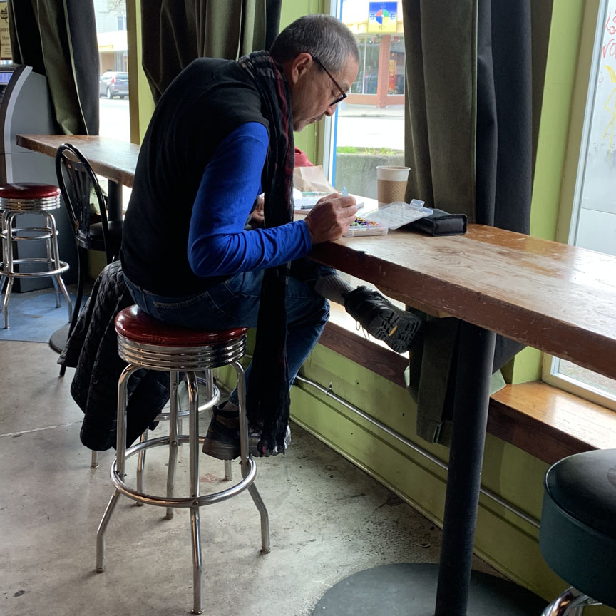
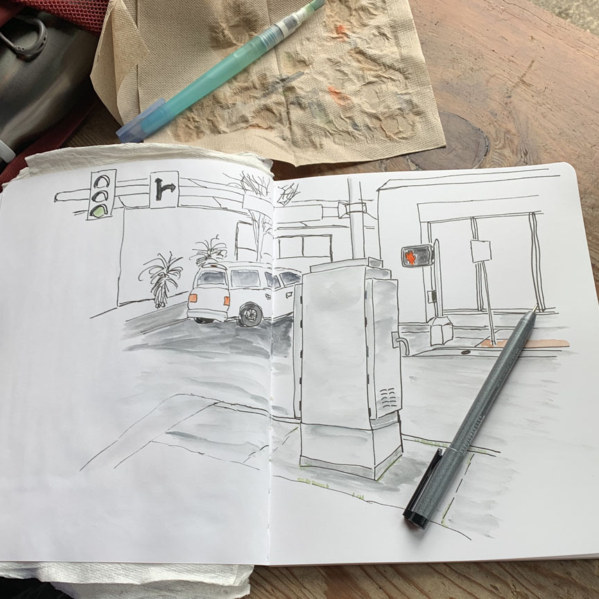
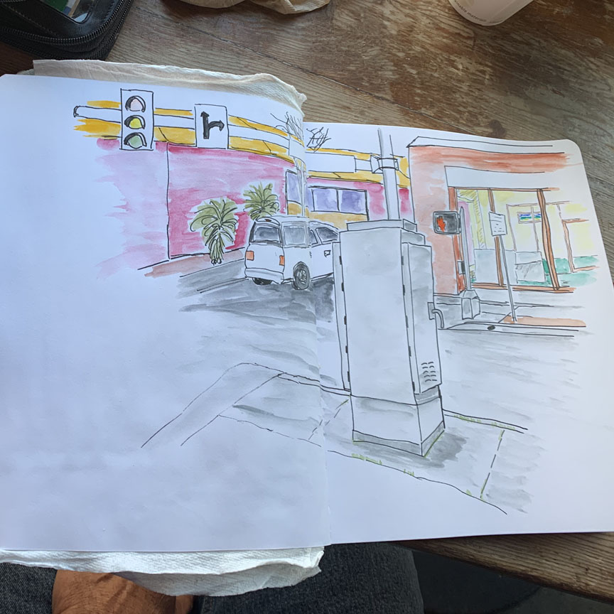 Hugh really did appreciate both the light and the scene outside. He’s using ink, and water brush directly to water soluble crayons.
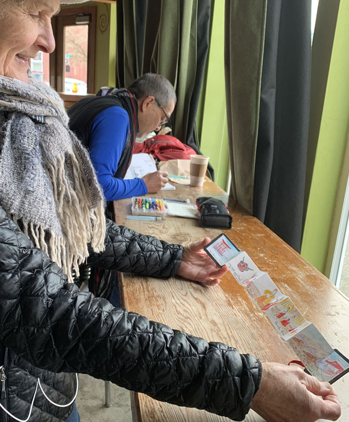
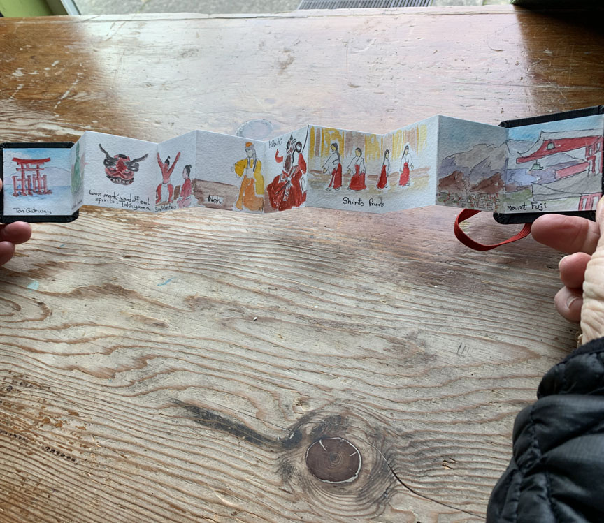
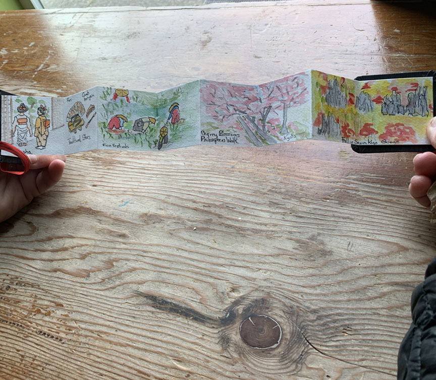 Sandy was so pleased to show us her tiny accordion book, with little scenes of Japan – all done in preparation for their upcoming trip!
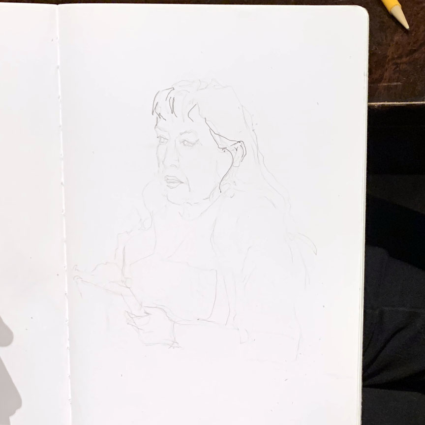
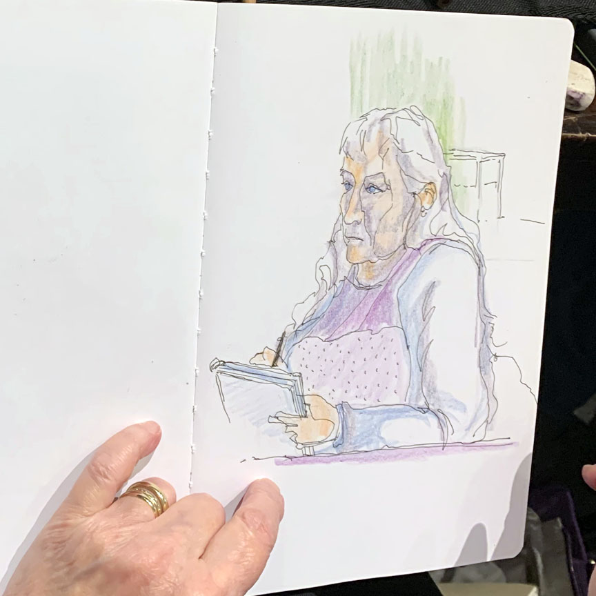
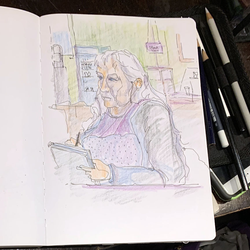 Marsha’s taking a class on doing portraits, here using colored pencils. It’s always so interesting to see the effects of layering.
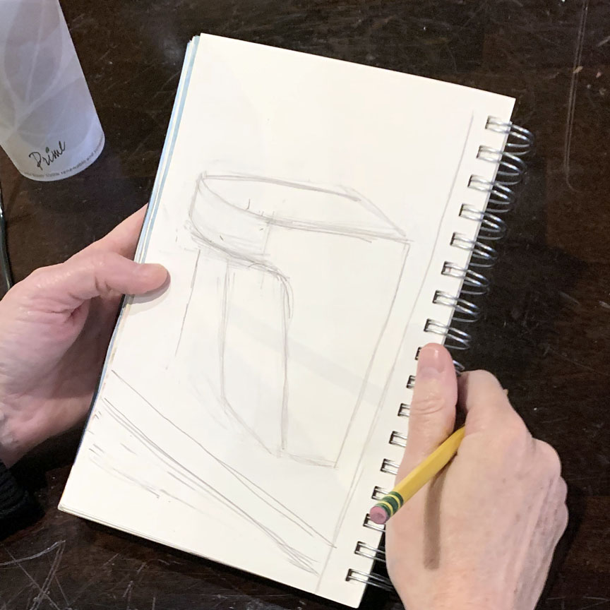
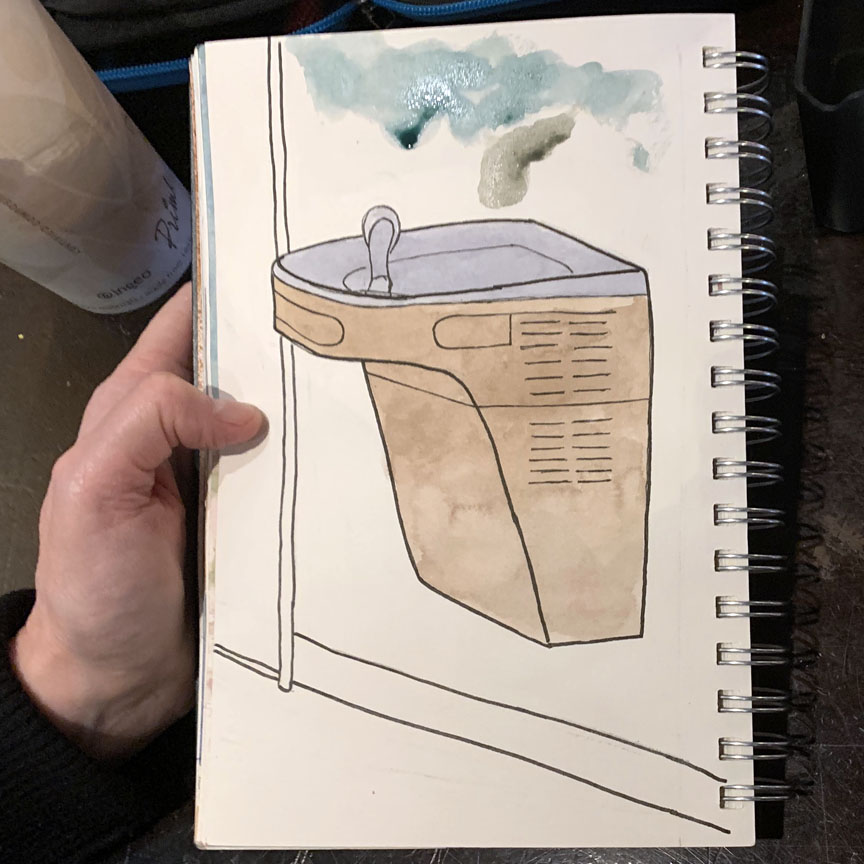
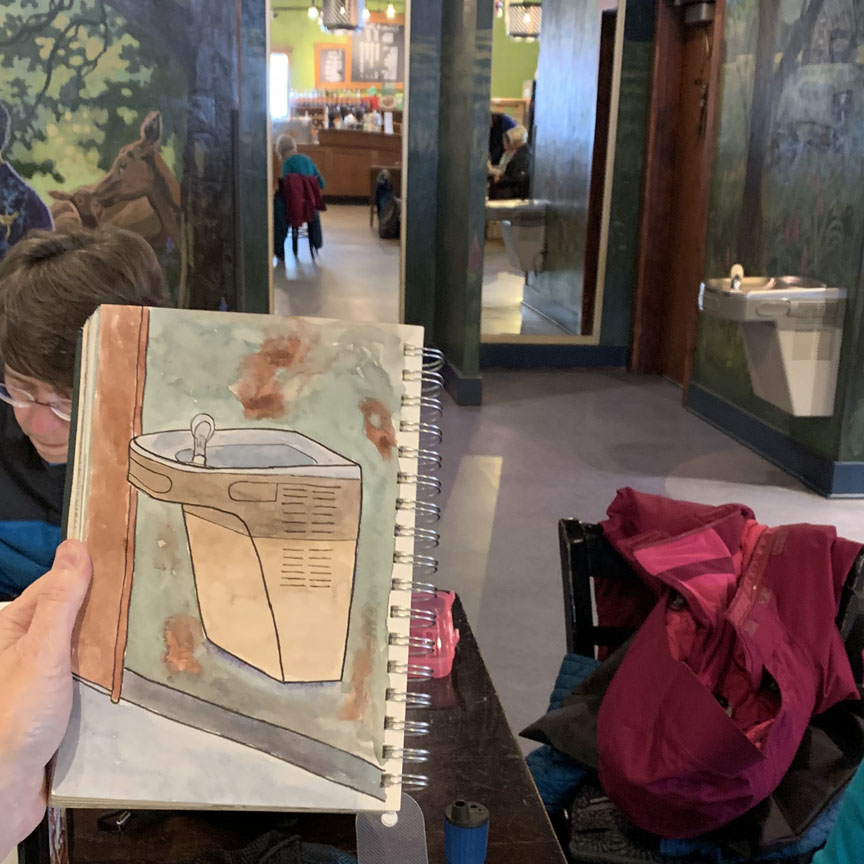 Meanwhile, the portrait’s subject, Danita, was busy sketching…uh… an abstract? No! It’s the water fountain in the hallway! Way to go!
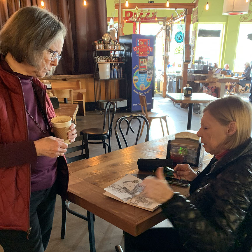
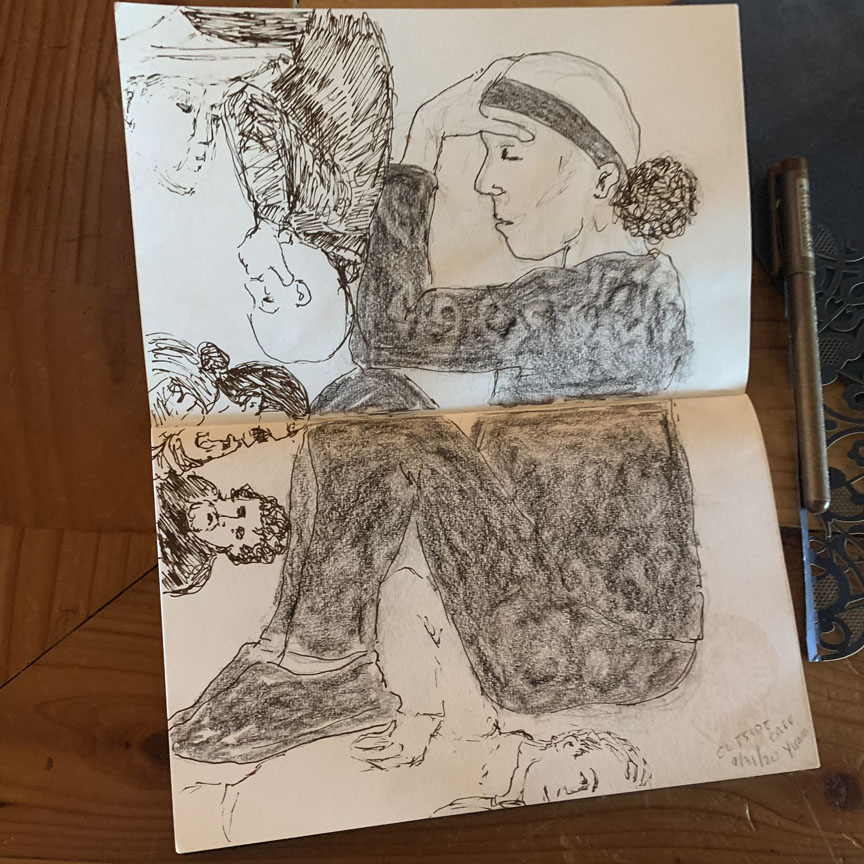
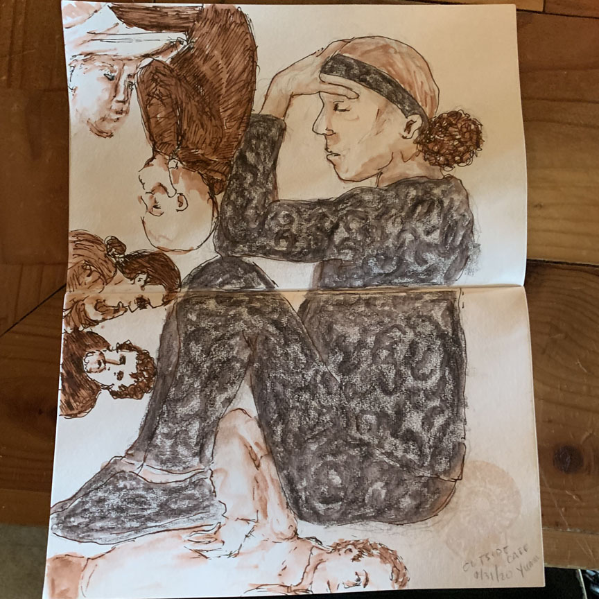 Then Marsha took a break to see what Barb Sh was doing – oh, a whole different approach to portraits, folks at a coffee shop.
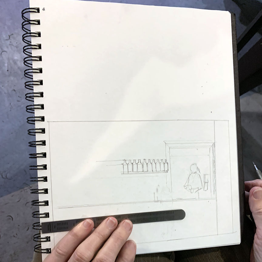
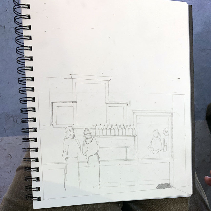
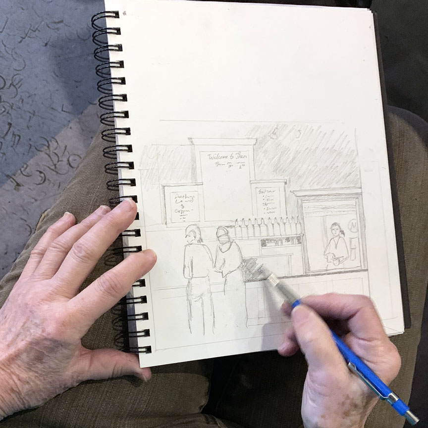 The bottles caught Carol’s attention, then the counter and the people! What a delightful scene she was able to capture! Nice.
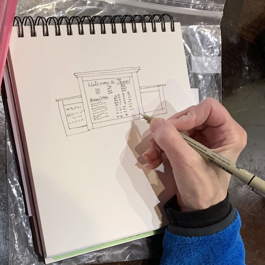
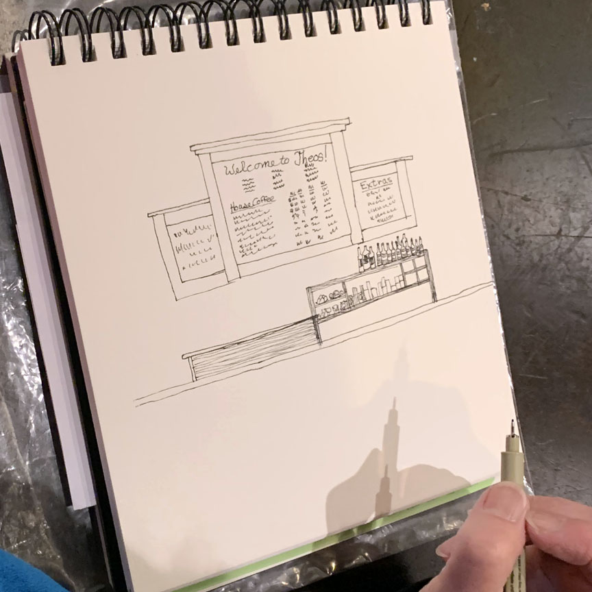
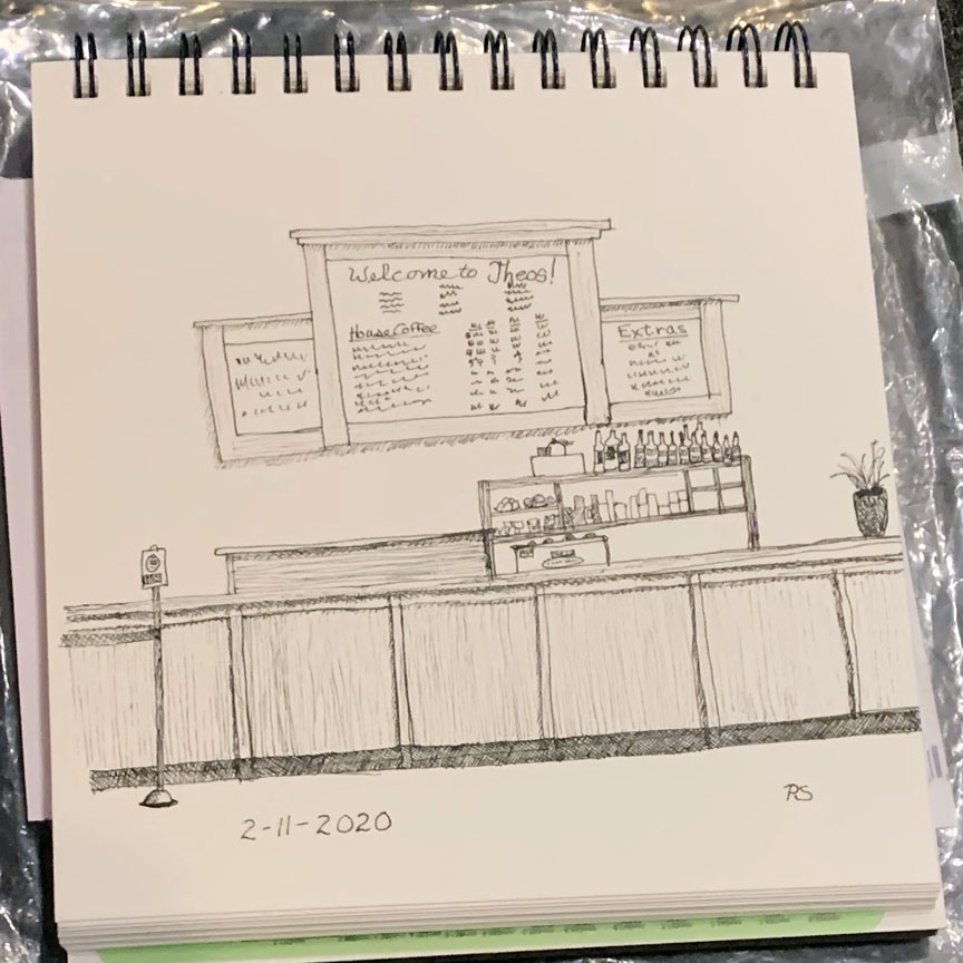 Peggy was looking above the counter, focusing first on the menu on the wall, then bringing it down to the serving counter. Well done.
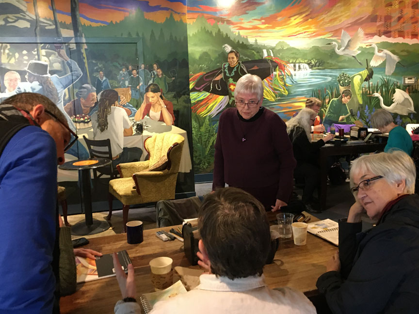 Hugh & Jane look in on Daisy & Katie – a lively conversation.
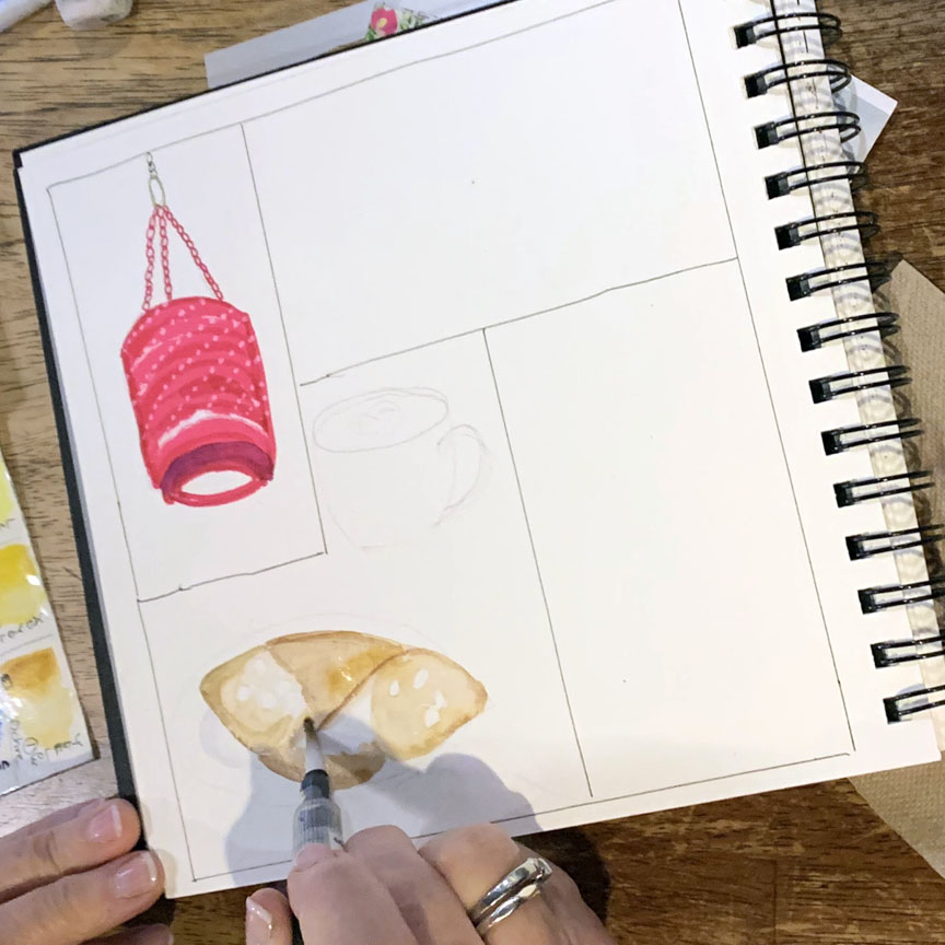
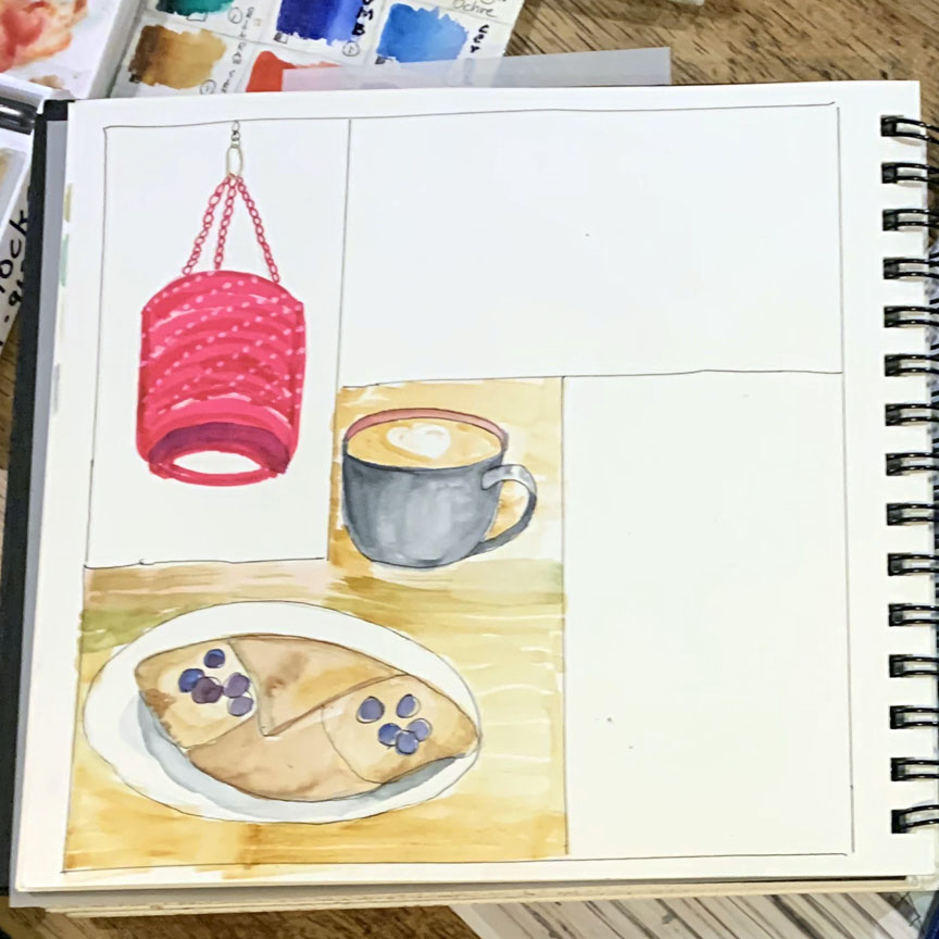
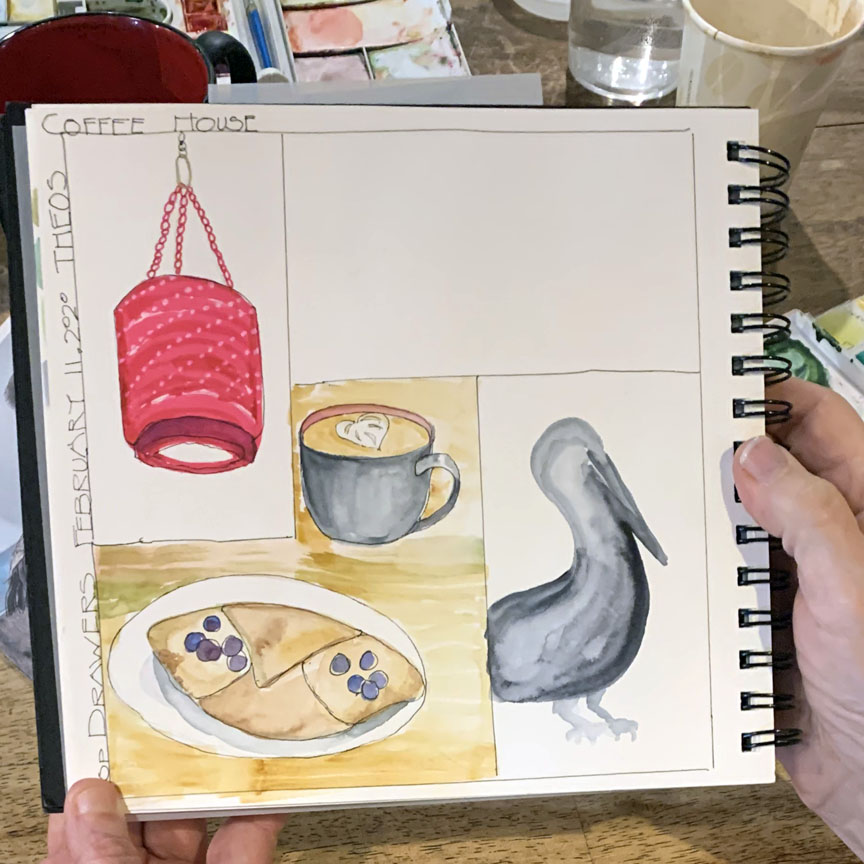 Here’s what Katie was sketching – the overhead washing machine tub light shades (amazing!), coffee &. pastry, and the mural bird!
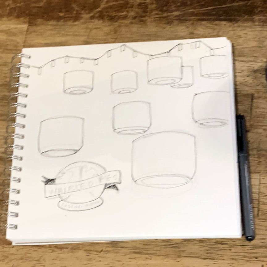
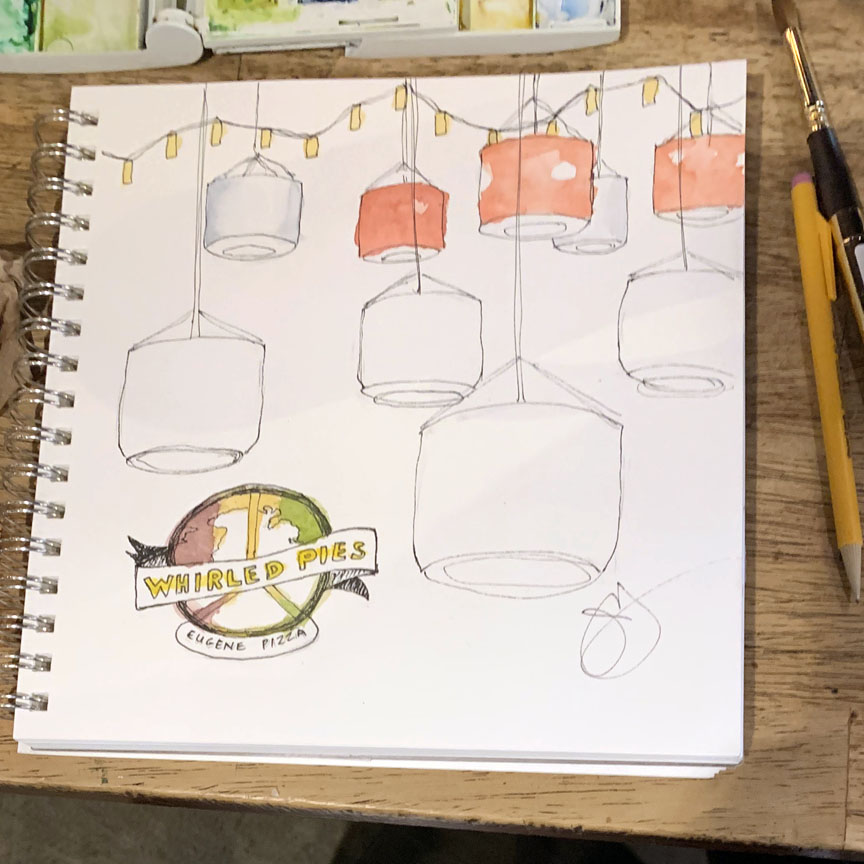
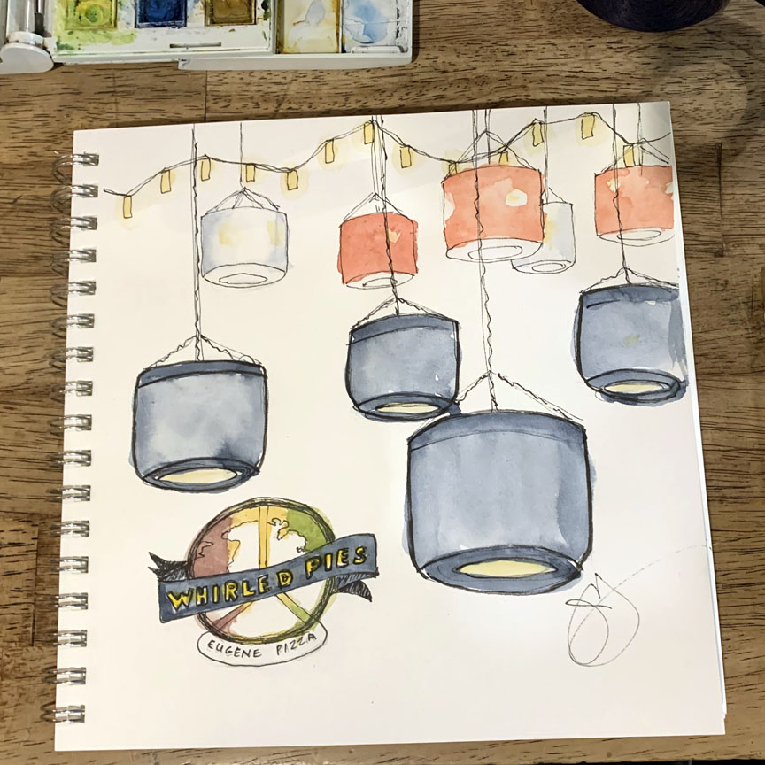 Jane was interested in the tub shades, too, but more from an overall design aspect. “I’ve had too much coffee!” she said when painting.
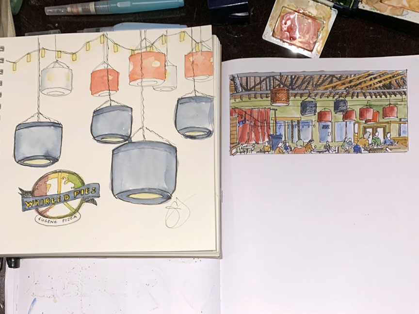 Jane & Katie weren’t the only ones mesmerized by the shades – here’s Jane’s sketch next to Jim’s, he included a lot of context. Great.
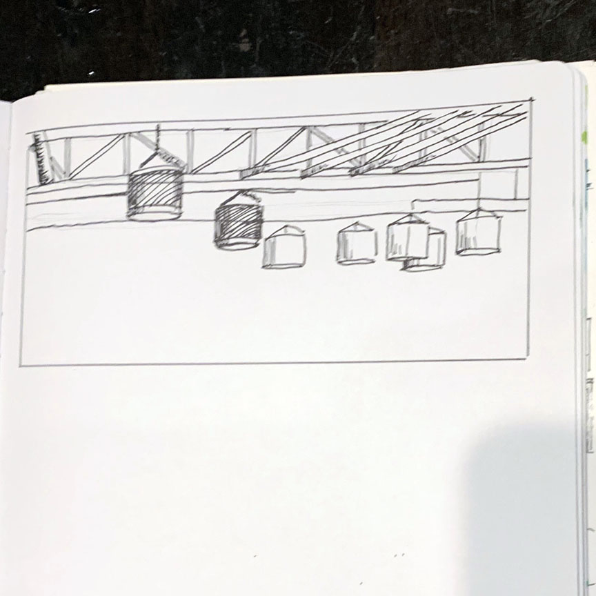
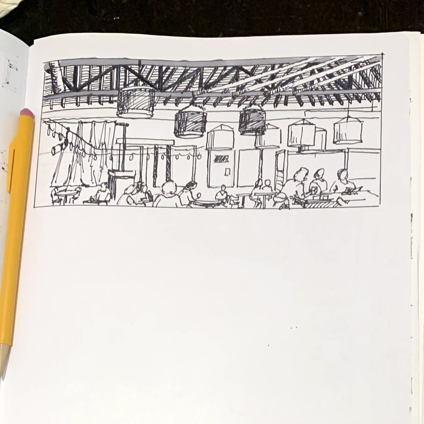
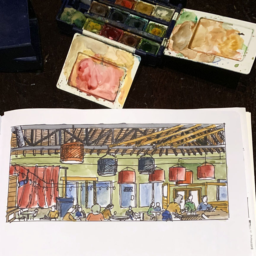 Here’s how Jim’s sketch developed – ink contour, details and cross-hatch shading, then watercolor. What a great cafe advertisement!
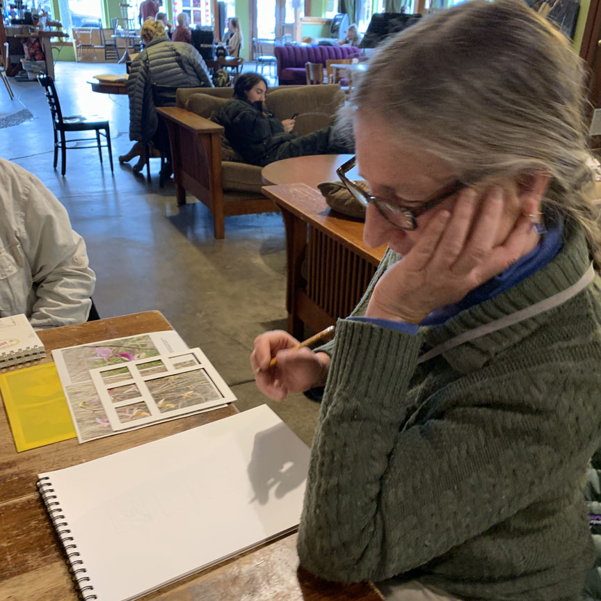
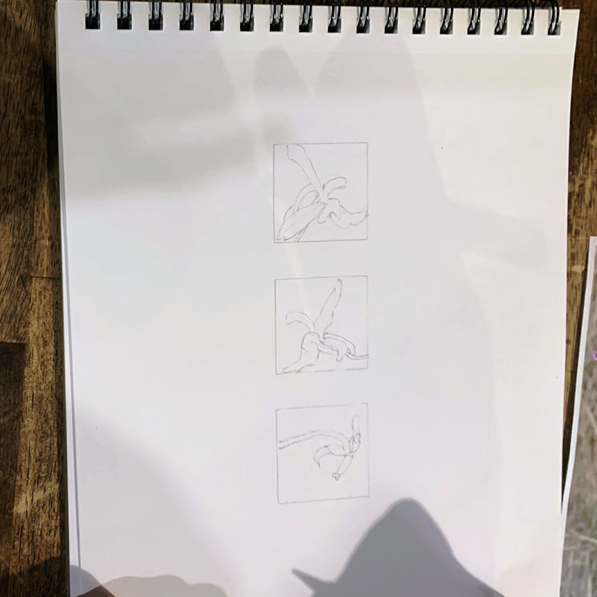 Bitty, who is usually so wet-on-wet spontaneous, decided to use the frame template so she could focus on sections of orchids. Keep coming back to see how this develops – it sure to be wonderful.